JR Chronicles - Saatchi Gallery
|
JR is a French photographer who grew up in the streets of Paris. As a teenager, JR started as a graffiti artist but began taking photographs when he found a camera on the underground. During those years, he used the camera to take images of his friends, which he then gave photocopies of the photos he took. He also pasted his work up in the streets of Paris and created 'Expo de Rue' (sidewalk exhibitions). JR creates multiple solo exhibitions around the globe, but he is never permitted to paste up his work. In addition, JR refuses any sponsorship or branding during his works as he believes he is only responsible for himself. While working, the most important thing to JR is the process of making his project's which is more important than the outcome.
|

|
|
In his works, JR created many projects that are created to narrate an individual's story visually. For example, 'Portraits of a Generation'. In 2005, in the riots of Les Bosquets, JR saw the images he had pasted his friends in the area in the news reports. The media distorted these individuals of Les Bosquets as bad people. In this project, JR wanted to challenge the stereotypical views of how the media portrays his friends being thugs, he wanted to show other characteristics of them, in contrast to how they are shown in the media. The technique he used to create this project was by using a 28mm lens and standing 10 inches from the model.
|

Portrait of a Generation: Braquage, Ladj Ly, Les Bosquets, Montfermeil, France, 2004.
|
|
Another project that JR created was called 'Women are heroes.' In this project, JR wanted to celebrate women and focus on women in places of conflict or the slum's as they are always the first to suffer. Moreover, during the project, JR tricked the media into finding out what was happening in Rio de Janeiro by not sharing any information and forcing the media to interview the women in the portraits to get the true story, as these women can tell their stories in raw detail of their livelihoods.
|

Brazil, Rio de Janeriro, Favela Morro da Providência, 2008
|
Three Highlights From JR Chronicles:
1 = The 'Wrinkles of the city' was one of the highlights for me in the exhibition as it showcased the lives of old people around the world. This project was focusing on celebrating the aging appearance as beautiful. This project stood out for me as many people in society express old age as ugly or a horrible chapter in life, but in this project JR is romanticizing old age, expressing it as a beautiful and natural thing that we all or will relate to.
2 = 'Still from the Gun Chronicles, 2018' = This project also stood out for me as JR showcased the concept of his skills, using a green screen effect to combine the multiple recordings/images he took. This was significant to me as I had not seen many photographs use this method to create photographs in motion from different locations.
3 = The Workshop = I enjoyed the workshop after exploring JR's exhibition because it allowed me to investigate the process of creating a collage linked to an issue that is happening in the modern world we are living in.

My Work From The Workshop
|

Still From The Gun Chronicles, 2018
|

The Wrinkles Of The City, Kadir an, Turkey, 2015
|
Portrait Of A Generation
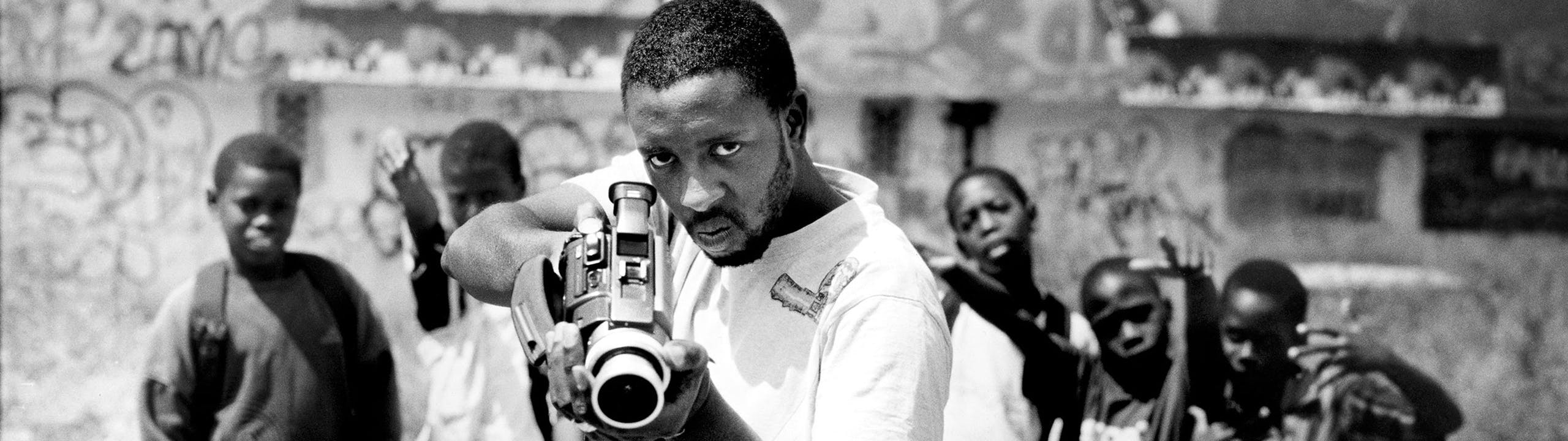
In 2005, in Les Bosquets, in the climate of social discontent, riots broke out which were trigged by the death of two teenage boys. During a broadcast of the riots, young people were presented in the media as out of control kids attacking police officers and firemen and looting anything they could. JR felt a sudden reaction on how the media presented his friends in the district. He felt that the media distorted the individuals of Les Bosquets as bad people. JR wanted to challenge the term racaille, or 'scum', the then Minister of the interior has used to describe the rioters. In 2006, JR went back to Les Bosquets and started the project 'Portrait of a generation' with the young people in the area. JR used a 28 mm lens and had to be 10 inches away from the person he was taking and shot full-frame portraits of young people pulling any expressions to caricature themselves and pasted the enlarged photos onto the walls of Les Bosquets The individuals who were in the portrait all had something in common: that they were not all angels, but JR wanted to challenge the stereotype of how the media portrays the residents of Les Bosquets.
I think this is an effective way to challenge the preconceptions we might have on people as JR demonstrates a different characteristic of the individuals he took. It showed the contrast between the portrayal of the media and JR's work of the young people in the area, which presents a meaning to his viewers: not judge a book by it's cover.
I think this is an effective way to challenge the preconceptions we might have on people as JR demonstrates a different characteristic of the individuals he took. It showed the contrast between the portrayal of the media and JR's work of the young people in the area, which presents a meaning to his viewers: not judge a book by it's cover.
My Response - 1
In this task I was required to respond to JR's 'Portrait of a generation'.
|
|
|


The Process |
Photographic ProcessTo create my image, I had to be very close to my model while taking their photo, as JR took close - up - shots of his models focusing on their facial expression and their eye's to draw his audience to look at the eyes to reflect on the model in his work.
Why Did My Model Choose This?I think my model choose this image for my poster because I think the image showcases their personality and the black hood frames their face which emphasises their eyes and facial expression which could suggest that they wanted to reclaim their identity.
|
My Response - 2
Best Edits

|

|
What Went Well And Even Better If?
WWW: My images express my intentions which were to create a similar style of JR's 'Portrait of a generation', as I focused on my subjects eye's to draw my viewers into their expression through their eyes.
EBI: I placed my poster's in a urban environment to make my images more dramatic and present the images in an area where young people go to in London.
EBI: I placed my poster's in a urban environment to make my images more dramatic and present the images in an area where young people go to in London.
JR Image Transfer
In this task I was required to create an image transfer by using a portrait I took in a style of JR.
My Response
|
The ProcessFirst, I cut up sheets of newspapers to create a collage as my background. The background is represented as the 'wall' in my response. Secondly, I used white acrylic paint to create depth on the strips, making the newspaper pieces look like graffiti walls. Thirdly, I choose a photo of my model and placed sellotapes on it to make the image see-through. I then soaked the back of the image to remove the paper at the back, again, to make the image see-through. Finally, I glued my image onto the collage.
|
Gordon Magnin


What Do You Think The Photographer's Intentions Are?
Gordon Magnin imposes geometric systems on high fashion faces. He does this by cutting out the geometric shapes out of the images and replacing them on a new angle, simply by removing the shapes completely. He wanted us to consider a new perspective of a very familiar subject matter in an extremely refreshing way.
What Wider Issue Is The Photographer Addressing?
Gordon Magnin is considering the depth of perception. This is shown by the geometric shapes imposed in his found images, which creates a new perception on a very familiar face, as Magnin uses images of found female fashion images. Magnin wanted to make a comment on how he see's the world. Magnin states, 'I have amblyopia in my left eye. This basically means that I am blind in that eye and it has a huge effect on depth perception. I think it makes me see things in a different way.'
How Do The Materials And Techniques Used Support Magnin's Response?
Gordon Magnin has used cut outs of geometric shapes on his found image. This creates a sense of abstraction as the model's face is distorted and reveals a the subject in a new perspective, transforming the selection of the model's face at different angles. This helps to support Magnin's point about depth of perception as the distortion of the face shows his audience a new perspective of a familiar subject matter.
My Response
The Process
Best Edits

After
|

Before
|
What Went Well And Even Better If?
WWW: My images express my intentions which was manipulating the geometric shapes to create distortion on my model's face.
EBI: The image was not closely cropped.
EBI: The image was not closely cropped.
What's Next?
To improve my images I will experiment further with creating distortion on my model's face with different shapes.
Fragments - Half Term Homework
Kehinde Wiley
|
Kehinde Wiley is an American photographer that is widely known for his naturalistic paintings and traditional settings of classic old master paintings of young black men and women. In Wiley's photographs, he intended to 'create paintings that are mysterious and snarky,' but also 'paintings that are sincere and able to change the world.' For example, in one of his pieces, 'Napoleon leading the army over the alps' he addresses the ideas about authority and historical representation. In the image we can depict Wiley's subject wearing an outfit that is contemporary and reflective of the hip-hop culture. Also in the image, Wiley has inserted a decorative backdrop. The background is infused with tiny paintings of sperms which is used to make fun at highly charged masculinity of gendered identity that are involved in the Western tradition of portraits.
|

Napoleon leading the army over the alps, 2005, Kehinde Wiley
|
My Chosen Artist: Frida Kahlo
|
Frida Kahlo was a Mexican painter known for her many portraits, self - portraits and works inspired by the nature and artefact's of Mexico.
In Frida Kahlo's paintings, she addressed the idea of identity as she worked obsessively with self-portraits. Frida was particularly interested in her German-Mexican ancestry, as well as her divided roles as an artist, lover, and wife. Frida Kahlo uses religious symbols throughout her paintings. Moreover, Frida uses her artworks as a tool of expression, a way for her to visually translate her memories and complex ideas that had ran through her mind as she had spent most of her time alone. |

Self-portrait With Thorn Necklace And Hummingbird, 1940, Frida Kahlo
|
My Response
The Process
Best Edit

Before
|

After
|
What Went Well And Even Better If?
WWW: My images express my intentions which were to re-create a similar theme that Frida Kahlo used in her paintings.
EBI: The model looked directly at the camera, as in Frida Kahlo's self-portraits she poses herself firmly and gives a direct gaze at her viewers.
EBI: The model looked directly at the camera, as in Frida Kahlo's self-portraits she poses herself firmly and gives a direct gaze at her viewers.
Kehinde Wiley
Kehinde Wiley's Intentions
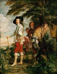
Le Roi à la chasse (Charles I at the Hunt), 1635
|

Le Roi a la Chasse, 2006
|
Kehinde Wiley's intentions are to provoke question and challenge stereotype, in order to explore how ideas of race, masculinity, power and reputation is shown in traditional paintings. He does this by re-creating a famous painting by Anthony Van Dyke, La Roi a la chasse (Charles I at the Hunt),1635. For example, both men have an air of superiority and power. The expression is carried out both through their clothing and stance, wearing clothes of their respective class and era's 'clausal clothing'. Furthermore, both artists used the 'Old master style', which was intended to impress the supremacy of the subject upon the viewer. However, Wiley re-constructs the original paintings to combine his own modernised style. For example, Kehinde Wiley paints a floral background to give a sense of softness to the painting. This contrasts with the typical profile of a black man, as over many decades, middle America has come to 'instinctively' see African-Americans as threats.
My Response
In this task I was required to create similar artworks by Kehinde Wiley.
The Process
Best Edits

Final Piece 1
|

Final Piece 2
|
Annotation
In this project I was able to create a similar piece of work by Kehinde Wiley, by enveloping my model in the background. I also developed my own idea by adding 'makeup' or using the paint tool to paint the contrasting colours that are presented in the background. For example, in the first piece of work on the left, I painted the lips red and the model's eyelid yellow which these colours are shown on the first background. This allowed me to add my own 'twist' in this set project.
What Went Well And Even Better If?
WWW: my model presented themselves as powerful.
EBI: The pattern outline was more accurate + there was more depth and form on my final images.
EBI: The pattern outline was more accurate + there was more depth and form on my final images.
Fragments Of A Building
Task 1: Patrick Cornillet
Patrick Cornillet is a painter, who paints architectural elements isolated from their environment and reconstituted in the form of objects in a white background. He also isolates his elements of images of plain sky, to make them seem like they are floating.The concrete makes us aware of the material and of the remains left by the humans and of time passing by. Cornillet creates a particular poetry and a mesmerising mysticism, though the buildings look dehumanising.

|

|
Response 1:
In this task, I was required to take pictures of buildings in a diagonal perspective, which are similar to the work's of Patrick Cornillet.
The Process
Photographer And Me

|
|
In this edit, I was inspired by Patrick Cornillet's series of work, creating isolated edit of buildings. I wanted to portray my building as powerful, overlooking the viewer. However, my edit did not showcase the similar ominous effect that Cornillet creates, showing the other effect of the object, again, illustrating the buildings as dehumanising.
Best Edits
|
My Edit
|

|
What Went Well And Even Better If?
WWW: Selected the important elements of the building.
EBI: The other half of the building was not cut out, so the building can look like it's 'floating'.
EBI: The other half of the building was not cut out, so the building can look like it's 'floating'.
Task 2: Mauren Brodbeck
In Mauren Brodbeck’s photographs do not register in the thoughts of passersby. Mauren Brodbeck creates a solid colour on buildings which are unnoticed by pedrestians or his audience. He registers in this secret to memory and changes it into a visual moment representing space and time, in an abstract concept.

|

|
The Process
Photographer And Me

My Edit
|
|
In this edit, I was inspired by Mauren Brodeck's series of work, creating colourful, solid buildings, which step aside familiar realities and reconsidering relationships with people and the environment. In my response, I took a picture of an ordinary building in my school and highlighted important areas of the building to capture the importance of the building, which was a similar point that was taken by Mauren Brodeck.
Best Edits

|
|
What Went Well And Even Better If?
WWW: Using double block colour to reveal the small details of the building.
EBI: The selection was neater as the selected areas selected elements, which I did not intend to select.
EBI: The selection was neater as the selected areas selected elements, which I did not intend to select.
Thomas Kellner
In Thomas Kellner's series of photographs, he shows us segments of a whole image, which come together as one image. His photographs do not necessarily deconstruct architecture but instead reconstruct our view of it. His work showcases famous landmarks. Kellner's images are intended for us to question our thoughts on how we visually process them and develop a sense of place.
Kellner uses the traditional process of film photography to create montages. Using just one roll of film, taking pictures of landmarks or buildings of significance from different angles to later re-arrange them on a contact sheet and create a unique composition.
Kellner uses the traditional process of film photography to create montages. Using just one roll of film, taking pictures of landmarks or buildings of significance from different angles to later re-arrange them on a contact sheet and create a unique composition.
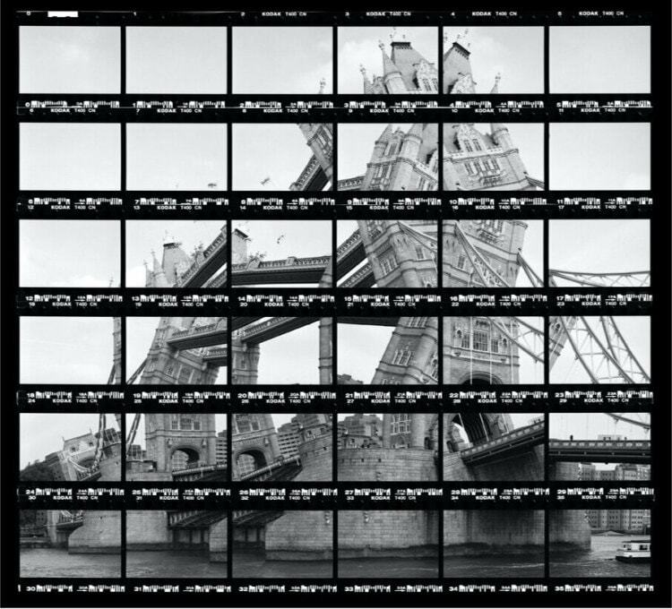
London Tower Bridge, 1999
|

Paris, Tour Eiffel, 1997
|
My Response
The Process
Best Edits
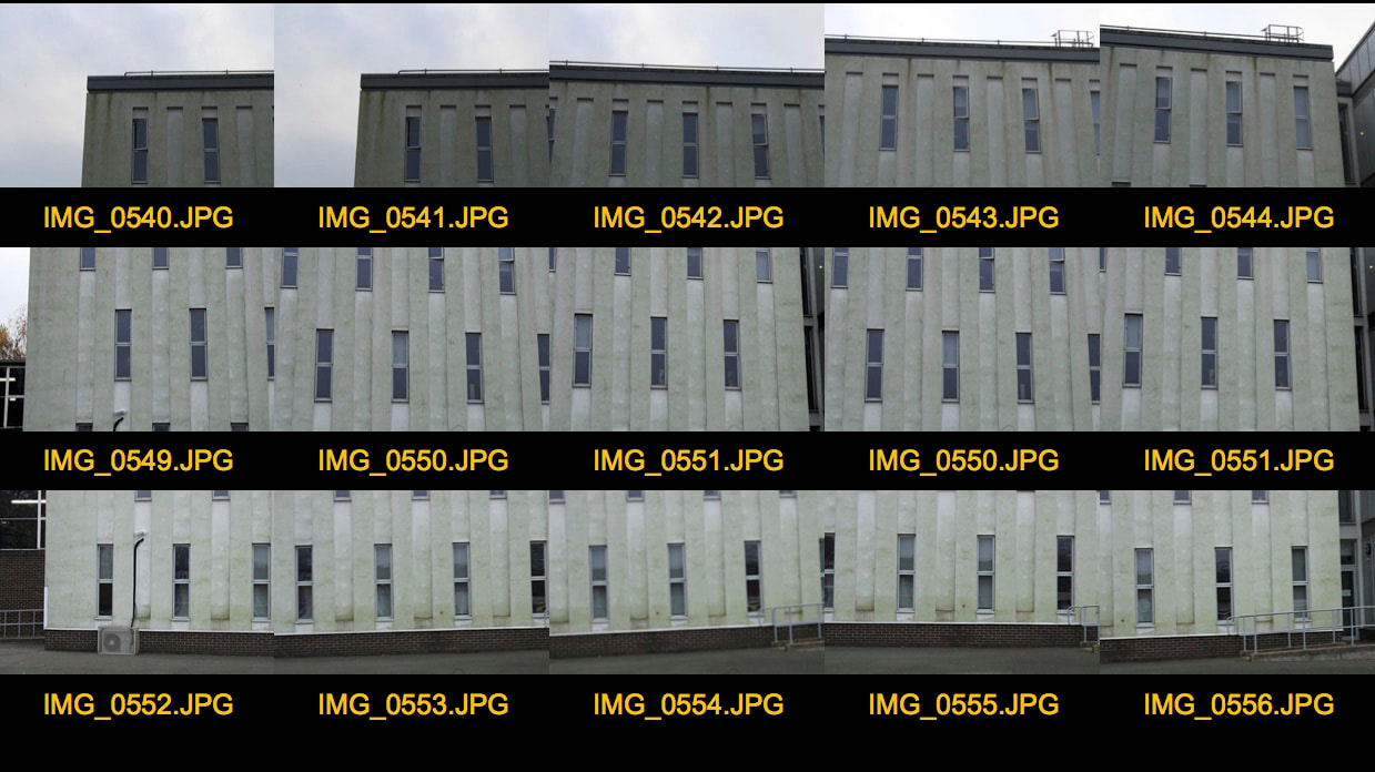
Photographer And Me
|
|

|
In this edit by Thomas Kellner, I was inspired by him creating a puzzle in his project, putting together pieces from the image, and combining into a single image. In my edit, I don't think I followed the deformation and movement of a building. I believe my edit does not show movement of the building, rather just each piece being reconstructed into one single image.
What Went Well And Even Better If?
WWW: My images express my intentions which were to re-construct an image of a building from fragments of the image.
EBI: Each row had the same number of images taken.
EBI: Each row had the same number of images taken.
Anastasia Savinova
Genius Loci, a series of photographs, created by Anastasia Savinova, explores the character and the spirit of a place. Each work is composed of numerous photographs of buildings and landscape forms that are specific to an area. She usually focuses on images of sheds and barns and other constructions, discovered during long road-trips, at times abandoned and ruined, secretly hidden outside the towns or solemnly standing in the middle of nowhere. Savinova's works balance between documentary and fiction, factual and imaginary spaces, and become keepers of the memory and the spirit of the place. She usually focuses on images of sheds and barns and other constructions, discovered during long road-trips, at times abandoned and ruined, secretly hidden outside the towns or solemnly standing in the middle of nowhere.

Genius Loci Series, Upland, 2014
|

Genius Loci Series, Noorland, 2015
|
My Response
In this task I was required to respond to Anastasia Savinova. This task links to 'Fragments' as the artist pieces together different parts of a building, into one image.
The Process
Photographer And Me

|

|
In this edit by Anastasia Savinova, I was inspired by the way she put together parts of a façade of a building, combining them into a single image, creating a fictional and fantasy house. Also, I incorporated her method of focusing on buildings in a certain area or with similar construction. In my edit, I focused mainly on houses in Muswell Hill, separating each characteristic of the buildings into one, showing the similar characteristics that each house equates. Furthermore, in a few of Anatasia's works in the series Genius Loci, she occasionally places the collage of houses on a boat, creating a surreal piece. I took this idea, placing my collage in a river, rather than a boat.
Best Edits
|
|

|
What Went Well And Even Better If?
WWW: My images express my intentions which were to showcase the characteristics of buildings in an area.
EBI: One thing to improve is that some of the images were brighter or darker then others, which means that next time I would try to make the images have a similar 'temperature' to each other.
EBI: One thing to improve is that some of the images were brighter or darker then others, which means that next time I would try to make the images have a similar 'temperature' to each other.
Independent Work: Three Strands
Kensuke Koike - Strand One

Ikebana #3, 2017
|

Ikebana #2, 2017
|
Kensuke Koike is a Japanese surrealist artist and visual artist who uses archive photographs. Koike spends his days buying old photographs at flea markets and distorting them in his studios. Every image he buys is re-composed and re-cycled to create a new image with a totally different set of potential interpretations. Koike tries to create meaning from an existing project, which is why he uses photographs from flea markets and re-cycled objects.
What Were The Photographer's intentions?
Kensuke Koike intended to create surreal projects by using archive photographs, deconstructing and reconfigureing vintage photographs and postcards to create sculptural works with surrealism and playfulness. Koike does this by using only using existing assets found within an image to create a contemporary visual with a new narrative. Each piece by Koike, brings us revelations about culture and truth in image making.
What Wider Context Is The Photographer Addressing?
Kensuke Koike is considering to express certain features of the portrait. This is shown by cutting parts of the face, leaving out only certain features of the portrait, to closely reveal the facial expression of the model. Moreover, Koike wants to reinterpret our reality by reconfiguring existing photographic materials. His images are ironic and rethought, offering new meanings and perspectives to his audience. Koike unlocks new worlds by playing with familiar moments which he creates a visual piece.
How Does The Photographer's Style Of Photography And Process Support Their Intentions?
Koike, combines found images in combination with the handcrafted formation of the works feels nostalgic, re-creating a new image with a totally different set of potential interpretations. Koike introduces a performative element to his practice through his exhibiting of processes and final works. He combines humour and reverence which creates in his vision. Furthermore, the cut-up vintage postcards are also used to create a sense of nostalgia for the pre-digital age, which is why he uses photographs from flea markets and re-cycled objects.
My Response
In this task, I was required to respond to Kensuke Koike. In this strand, I necessarily did not follow the steps the photographer took to create his pieces. Instead, I added my own 'playfulness' to the image, creating a melting affect.
The Process
Photographer And Me

My Edit
|

Ikebana #3, 2017
|
In this edit, I was inspired by Kensuke Koike's idea to cut out a majority part of the face, only leaving certain characteristics, such as, the eyes and the lips. I took this approach, but not to the extent of the artist, as I wanted to have enough area of the face to create a melting effect on my model's face. Moreover, I decided to melt my model's face, because when I first saw Kensuke Koike's series of work, I thought it looked like the face was melting off. So, I took this thought and created it onto my own edit.
Best Edit
What Went Well And Even Better If?
WWW: The subject I chose to photograph suited the theme as it was based on a portrait of a person, creating a sense of 'playfulness' to the image as well.
EBI: A few areas which were liquefied distorted areas that I did not intend to distort.
EBI: A few areas which were liquefied distorted areas that I did not intend to distort.
Gabriel Garcia Roman - Strand Two

|

|
What Were The Photographer's intentions?
Gabriel Garcia Roman intended to create images in Flemish and Christian Orthodox paintings, while illuminating contemporary figures, which are multi-dimensional, powerful and proud. Roman places a halo above their subjects head as 'they are modern day saints of our community' he sees the halo as a 'badge of honour', which emphasis the subjects empowerment in the portraits.
What Wider Context Is The Photographer Addressing?
Roman is considering to respond to the gap of the sever lack in representation of queer people of colour. He quotes, “I think the young queer people of colour living in rural areas need to see this work, so they can feel empowered by seeing somebody that looks like them in this light.” He decided to respond to this by creating personal body of work to highlight his own community of friends and writing their thoughts identity behind them (the subject).
How Does The Photographer's Style Of Photography And Process Support Their Intentions?
To create these textural artworks, Roman uses a multi-step printmaking process. The photographs are photogravure prints where the photographic negative is transferred to a metal plate and etched in. Gabriel adds patterns and textures to the prints using decorative papers in a chine-colle technique, making variations. of each portrait that are photographed. Finally, he then places text at the back of the portrait which are handwritten by his subjects, sharing their thoughts on identity.
My Response
In this task, I was required to respond to Gabriel Garcia Roman's work, re-creating a portrait that links to themes of representation and identity.
The Process
Photographer And Me

|

|
In this edit, I was inspired to create a similar piece by Gabriel Garcia Roman. His use of colour struck me when I first saw his images. The bright, solid block colours, illuminates the main subject of the image, illustrating their importance in this piece. Moreover, making areas of the subject black and white, and leaving their clothes only in colour, conveys how clothing or the way you dress plays a big part in identity. Presenting yourself through the way you dress links with the idea of Gabriel Garcia Roman's work's being about identity and representation, which I took upon to demonstrate this idea. Furthermore, asking the models themselves to write their thoughts, makes the piece more personal as they express their personal feelings. I took this approach as well, asking my model how they feel about their sexuality.
Best Edit
What Went Well And Even Better If?
WWW: My images express my intentions which were to create a similar piece that links to the Gabriel Garcia Roman's motives about representation and identity.
EBI: The image is too pixelated and somewhat a bit blurred.
EBI: The image is too pixelated and somewhat a bit blurred.
Daune Michals - Strand Three

Grandpa Goes To Heaven, 1989
|

Chance Meeting, 1970
|
What Were The Photographer's intentions?
Daune Michals intended to create surreal stories, separated into moments, blending images with text in a format that is similar to cinematic sequences. The text he places on his sequences, give another dimension to the image's meaning and gives voice to Michal's singular musing, which are poetic and tragic. An example of one of Michal's popular sequence is, 'Grandpa goes to heaven.' In this sequence, the beginning is quite sinister, the whole frame is completely focused, with a balance between dark and light areas. However, the next few frames completely contrast with the first frames. Michals creates a supernatural aura, overexposing the photos and lets the natural light from the window become a surreal blaze.
What Wider Context Is The Photographer Addressing?
Daune Michals was in the field of photography during the 1960s, in an era that was heavily influenced by photojournalism. Michal's medium is always manipulated, exploring themes of sex, death, dreams, memory and youth. As a result, Duane's narratives are potential to its raw, personal expression. He challenges his audience to question his work rather than get answers through them, as he challenges his immense oeuvre to his viewers.
How Does The Photographer's Style Of Photography And Process Support Their Intentions?
To create these sequences, Michal uses appropriate cinema's frame-by-frame format, placing each photo into each frame, creating a sequence or a story. His sequences are always in black and white to portray certain themes in his sequence, that link to intangible human dilemmas, such as mortality and desire. He also derives poetic effects from technical errors such as double exposure and motion blur, "removing" his subjects out of focus when needed. His use of text is fundamental in his photo's, as they give dimension to the images', providing his own observations of the subject matter.
My Response
In this task, I was required to respond to Daune Michals' series of photo sequences, creating my own frame-frame images.
The Process
Photographer And Me

My Edit
|

Dr. Heisenberg's Magic Mirror Of Uncertainty, 1998
|
In this edit, I was influenced by Duane's surreal stories. The usage of the camera, to create these frames, to illustrate emotion occurring in each slide. For example, overexposing the image or making the subject matter blurred and out of focus. Though I did not take these steps, I still took the idea of making my images black and white, which is a necessity in Daune's stories. Making each frame black and white promotes questions on why there is a minimal amount of bright colours. The black and white montage, also allowed me to explore themes. In this piece, I am exploring the theme of youth. Youth is a precious part of life, the continuous flowers piling onto the model is representing him growing up. The end frame is illustrating the loss of childhood. The model finally enters the real world.
Best Edit
|
|

|
What Went Well And Even Better If?
WWW: My images express my intentions which were to create a sequence of images.
EBI: The image is not contrasted enough.
EBI: The image is not contrasted enough.
Development 1
During the developments of 'Three strands', I was interested on my second strand, which was a series of works by Gabriel Garcia Roman. I enjoyed creating this strand, because it allowed me to experiment with colour, shapes and texts. This project also was one of my personal pieces, as I asked my model to write about their own thoughts on their identity. In this next development, I would like to re-create the similar process approached before, but rather digitally,I would like to experiment with creating the work by 'handmade'.
Steps I would take in this development:
- Take more pictures of different people.
- The text can be handwritten by the model.
- Use paint.
Steps I would take in this development:
- Take more pictures of different people.
- The text can be handwritten by the model.
- Use paint.
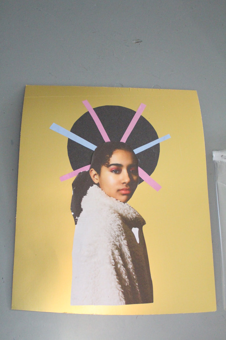
My Response
In this task I was required to improve my previous edit by Gabriel Garcia Roman and try different methods to develop my previous work.
First Attempt
|
|
The Process
The method I took to carry this development is:
1 = I used gold cardboard as my main background for my images.
2 = I used black card, and cut it out into a circle to create a halo.
3 = I used multiple different coloured cards, and cut it out into long strips, which surrounded around the halo.
1 = I used gold cardboard as my main background for my images.
2 = I used black card, and cut it out into a circle to create a halo.
3 = I used multiple different coloured cards, and cut it out into long strips, which surrounded around the halo.

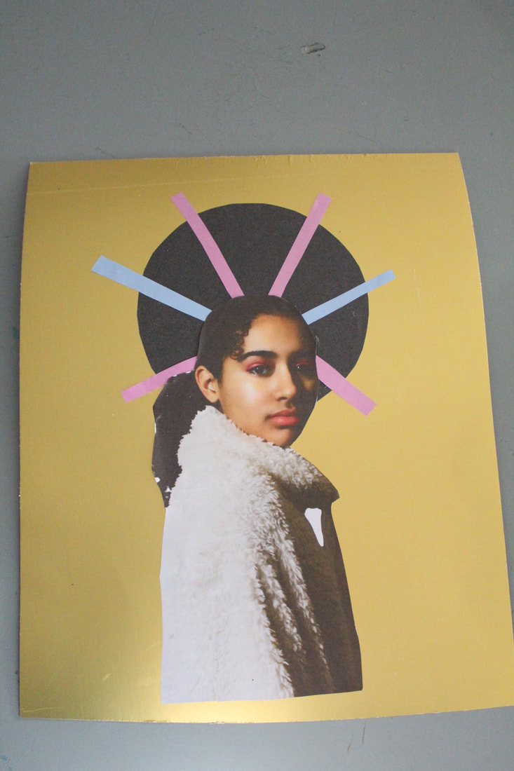
4 = Then, I used the text tool to create the text on the composition.
|

6 = I added a timeline to create the GIF and changed the speed.
|

5 = Next, I used blending option to change the opacity of each text, to blend the text with the background.
|

7 = To create the colourful strips, I used the adjustment layer 'channel filters', then masqued my layer, so the adjustment layer can only effect the colourful strips of paper.
|
Best Edit Now VS Best Edit Before

|
|
In both of my edits, I was responding to Gabriel Garcia Roman's work. In my first edit, I responded to Gabriel's idea of identity, which I demonstrated by asking my subject's thoughts about their own identity, which I wrote up onto my composition. However,
the text did not blend well into the composition, so I decided to improve this error by developing it into my development.
In my first development, I decide at first to not create some parts of the project digitally. Instead of creating the colourful strips and the black halo in the background in photoshop, I used pieces of card paper. In contrast, the text was written in photoshop, but I wanted to improve my previous error, so instead of making the opacity of text 100%, I played around with the blending option to make it seem as if the text is written onto the cardboard. I also wanted to make my development into GIF, and layer the text onto the composition, as Roman's work presents his text being layered around his subject.
Best Edit
|
|

|
What Went Well And Even Better If?
WWW: One thing that went well was the continuous change of colour of each strip in each frame.
EBI: One thing that I would improve is improving the quality of the GIF, as it looks very pixelated.
EBI: One thing that I would improve is improving the quality of the GIF, as it looks very pixelated.
Development 2 - Daniel Buetti

|

|
Daniel Buetti is a contemporary Swiss artist who creates multi-media practices, incorporating light installations, performance, and sculpture in exposing the fragility of popular culture. In a few of Daniel Buetti's series of work, he modifies pictures of supermodels from journals and magazines, by drawing tattoos and scratching adhesions on their printed skin. Buetti's work emphasies on our obsession for fame as well as our idea about life. This is conveyed by his placement of text of unanswerable questions, such as, 'is being good, being liked?'
My Response
In this task I was required to respond to a series of Daniel Buetti's work.
The Process
Photographer And Me

|

|
In this edit, I was influenced by Daniel Buetti's presentation of the text in his series of works. Daniel Butti presents his text by writing them in small continuous dots, which I followed through with as well in my piece. However, it was very challenging to create depth in the text, as I wanted my message to be readable towards my viewer. Furthermore, Daniel Buetti also draws the small dots to outline certain features of the model, which I also demonstrate in my piece, as I highlight the model's earrings, hair, and hand, creating further depth in the image and highlighting certain features.
Best Edit
What Went Well And Even Better If?
WWW: My images express my intentions which were to find another alternative to presents text.
EBI: Time of day was not appropriate for the task as the conditions were very windy.
EBI: Time of day was not appropriate for the task as the conditions were very windy.
Development 3 - Andy Gellenberg

FN Achievement Awards - Sandra Choi - Creative director of Jimmy Choo Ldt.
|

Famous Headz
|
Andy Gellenberg worked in a communication design and a renowned illustration studio, until he started working on his own career in 2014. Andy Gellenberg's bold and vibrant style and his combination of simple geometric shapes, creates a sense of playfulness and a burst of youthful energy in his artworks for international clients traversing music, sports, fashion and beyond.
My Response
In this task I was required to respond Andy Gellenberg.
The Process
Photographer And Me

|

|
In this edit, I was inspired by the simple geometric shape he placed onto the models face, to sculpt a 2D illustration. Also, The combinations of bright colours and the sense of playfulness through his style aspired me to create my own edit of his series of work. This type of style presented in Gellenberg's pieces was providing me a wider opportunity to experiment with colour and shapes, and a new discovery of manipulating 3D images into a 2D illustration.
Best Edit

|


|
My Final Outcome

Annotation
In my outcome, I wanted to showcase different viewpoints of my model in the style of Andy Gellenberg. For this piece, I wanted to experiment with colour, the different combinations of colour, and the use of geometry. Andy Gellenberg's style enforced me to present a sense of playfulness through the combinations of bright colours plastered onto irregular shapes. Furthermore, the idea of presenting a different perspective of my model was to show to the viewer the different characteristics of my model from multiple outlooks. These varied perspectives also utilized the varied shapes that were created, as they follow through the model's facial features, therefore, creating a wider outlook on the model's profile in closer depth.
Overall, this outcome was an opportunity for me to widen my creativity, allowing me to experiment further with my editing skills and a chance for me to learn new techniques, such as displacement mapping. This outcome further allowed me to display the ideas Andy Gellenberg wanted to present in his series of works: playfulness and a sense of youthfulness, which the bright colours and abstract shapes emphasise.
Overall, this outcome was an opportunity for me to widen my creativity, allowing me to experiment further with my editing skills and a chance for me to learn new techniques, such as displacement mapping. This outcome further allowed me to display the ideas Andy Gellenberg wanted to present in his series of works: playfulness and a sense of youthfulness, which the bright colours and abstract shapes emphasise.
What Went Well And Even Better If?
WWW: My images express my intentions which were to present someone's face into a 2D illustration, by using solid coloured geometric shapes to manipulate it into this style.
EBI: One thing I would improve is by not cropping my composition very tightly.
EBI: One thing I would improve is by not cropping my composition very tightly.
Final Outcome - Dominic Beyeler

|

"I am nobody who are you?" Nr.2
|
Dominic Beyler is an illustrator, graphic designer and art director. In Beyeler's daily sketches, he balances bold colours and swift lines. Dominic captures a fierce vulnerability within every face, which is presented through the bright colours splashed onto his subjects face. Dominic also illustrates text onto his subjects face with messages targeted towards his audience, for example, "I am nobody, who are you?" In his recent piece, "I am nobody, who are you?" he created a GIF, which contained multiple different patterns and faces, which were projected onto a 3D head,
In my final development, I would like to create a similar project to, "I am nobody who are you." To create this, I am thinking to take a picture of someone and use their face to create the patterns I will also use the timeline tool to create a GIF, capturing some of the patterns floating on my subjects face.
In my final development, I would like to create a similar project to, "I am nobody who are you." To create this, I am thinking to take a picture of someone and use their face to create the patterns I will also use the timeline tool to create a GIF, capturing some of the patterns floating on my subjects face.
Response
In this task I was required to respond 'I am nobody who are you?' by Dominic Beyler
The Process
Photographer And Me

|

|
In this edit, I was inspired by Dominic Beyler's use of colour and patterns. For example, in my edit I wanted to create the familiar splashes of paint in a series of Beyler's paintings, by using the ink paint tool, combining a variety of colours. Moreover, the idea of creating my piece into a GIF, was by the inspiration of Dominic Beyler's work, 'I am nobody, who are you?' The presentation of colours, being suddenly splashed onto the model's face and the sudden exposure of the swirly lines, influenced me to create a GIF, instead of a still piece. In the GIF, I combined the familiar characteristics he illustrated in his GIF and merged my own idea into this piece, therefore, completing the final outcome.
Best Edit

|

|
What Went Well And Even Better If?
WWW: The patterns on my composition run smoothly, which I intended to do.
EBI: The quality of the GIF improved when exported.
EBI: The quality of the GIF improved when exported.
Final Outcome: Development 2 - Dominic Beyeler
In this project I wanted to re-develop my previous development of Dominic Beyeler and present a variation of different poses from models. In addition, I would also like to create a smoother animation through my GIF, as my previous development did illustrate a smooth animation across my model's face, the second edit did not present that. Furthermore, I would also like to create a more creative GIF, developing further with Dominic Beyeler's style of art.
My Response
The Process
Best Edit Now vs Best Edit Before

|

|
In my new edit, I wanted to bring in familiar and also creative elements into this piece, which were not present before. Though my new edit does have some similar components to my previous development, it did not express the artistic attributes presented by Beyler. In this new development, I created a watercolour texture onto my subject to showcase the similar features shown in Beyler's drawings. In addition, I also developed how the splashes form over the face of the subject, which created a smoother and more creative formation. The concept behind the almost "broken pieces" illustrated on the splashes, was to illustrate someone destroying or bringing colour towards a traditional painting.
The new final outcome has allowed me to be more creative, more confident with colours and texture, and allowed me to convey a much smoother exposure of the patterns devouring my subject's face, which were not present in the previous final outcome.
The new final outcome has allowed me to be more creative, more confident with colours and texture, and allowed me to convey a much smoother exposure of the patterns devouring my subject's face, which were not present in the previous final outcome.
Best Edit

What Went Well And Even Better If?
WWW: My images express my intentions which were to present an artistic animation.
EBI: The quality of the GIF improved.
EBI: The quality of the GIF improved.
