Homework
Laura Letinsky - Aftermath
What Are The Photographer's Intentions?
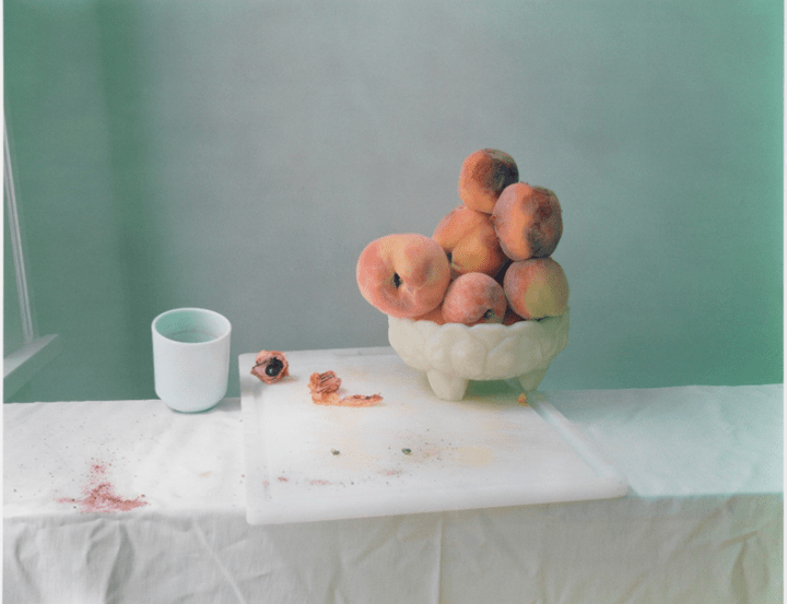
Laura Letinsky creates contemporary still life photos around her home. She does this by placing objects on a white table cloth and taking pictures of the aftermath of what happened during those hours. Letinsky wanted us as an audience to consider that every picture has a story behind it. For example, in the picture above this picture could imply that someone was eating or making or doing something, or there could be a much darker meaning that we as the audience have to elucidate in our way on how we view this photo.
What Wider Issues Is The Photographer Addressing?
Laura Letinsky is considering the acts of society. This is shown by the white cup almost at the edge of the table about to fall and the small, broken pieces of the peach and the stain from the peach planted on the white table cloth. Letinsky was interested in showing this issue in her photos as she describes society as unbalanced and how our picture of things in this world is all 'sugar-coated' on the idea of what we want, and what we want to achieve in this one life we have. Laura Letinsky's images explain the truth about the society in our world. This is described by the white glass on the edge of everything and the destructed peach which represents the corruption in society today.
How Do The Materials And Techniques Used To Support The Photographers Intentions?
Laura Letinsky has used digital manipulation techniques and has increased the number of the aperture of the camera in her compositions. This creates an optical illusion effect in her photo. This is shown by the peaches in the bowl, as the viewer tries to interpret if the still object is three-dimensional or two-dimensional. Creating this effect draws the viewer's attention towards the image as the illusion leaves an ominous question to the audience to think about. This helps to support Letinsky's point about the way society is interpreted in a fictional way as the bowl of peaches beholds a truth behind on what shape it is, this resembles our society hiding what truth this world beholds.
Practical Response - Laura Letinsky
Best Edits


Re-Takes
Best Edit


What Went Well & Even Better If?
WWW: I think one thing that went well was that there were many variations such as taking photos at different angles of the object which means I could show the viewer each way the object can be shown in each photo and show the different truths.
EBI: There was less negative space and that I could improve the focus of my camera as the majority of the photos were blurry. Furthermore, it was hard to pick an object to take as multiple objects would 'take away' the symbolic motive.
EBI: There was less negative space and that I could improve the focus of my camera as the majority of the photos were blurry. Furthermore, it was hard to pick an object to take as multiple objects would 'take away' the symbolic motive.
Jan Groover - Kitchen Utensils
What Are The Photographers Intentions?
.Jan Groover creates intimate/formalist still life images. Groover does this by zooming in or coming close to her composition showing every detail of each object from the reflection of the utensils. Jan Groover wanted us as the audience to consider that simple objects are more than what they are used for and that they symbolise something special in the way our mind interprets them and how if we took a closer look we as the viewer can see the wider picture on how these objects symbolise different concepts.
What Wider Issues Is The Photographer Addressing?
Jan Groover was considering the formality in photography and how each object has a certain physical characteristic and Groover's meaning of her depiction was to show the form and shape of the object. This is shown by how the light reflects an image through each utensil as each object overlaps between each other giving a different shape. She was interested in this issue as she once quoted on how important each objects 'energy' was for her. The quote that she stated was, "What kind of energy does this object have I space?" Furthermore, Jan Groover was considering the role of women in society. This is implied by the typical symbolization of kitchen utensils and that kitchen utensils are needed for our daily lives. Groover was interested in this issue as she could have wanted to show the audience that utensils are more than a simple object to show the closer picture of who they are, so you would see that woman have more abilities than just being associated with kitchen utensils.
How Do The Materials And Techniques Used To Support The Photographers Intentions?
Jan Groover has used inspiration from renaissance paintings and postmodern style in creating her works. This creates a powerful image with the question of perspective taken from the utensils and the transformation of the light being its own object as it reflected within the reflective surfaces of the objects creates this dynamical composition of simple objects overlaying each other. This helps to support Jan Groover's point about the roles of women in society as it implies that women are not represented as simple objects such as kitchen utensils as they have the power to do more things and that women are dominant and independent.
Practical Response - Jan Groover
Best Edits


Re-Takes
Best Edits


What Went Well & Even Better If?
WWW: One thing that went well was placing the utensils into any order which created an effect of shape and form.
EBI: The light could of reflected more towards the objects giving luminosity towards my subject.
EBI: The light could of reflected more towards the objects giving luminosity towards my subject.
Burning House Project - Robert Holden

In today's task, we were told to collect objects which we would take if our house was on fire. We had the option to pick the necessary objects for survival or sentimental objects. In this task we displaced our objects on a grid format and placing them in different layouts. To improve these photo we had to have zero shadow and reflection as this would distract the viewers attention of the objects.
Best Edits


Re-Takes
Best Edits


Shape And Form - Andre Kertesz
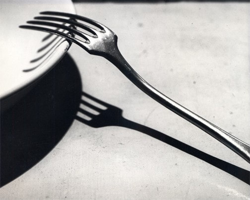
Fork - Andre Kertesz, 1948
André Kertész created the image ‘Fork’ in 1928. At this time he lived in Hungary where he mixed with artists from the Dada movement. Kertész believed photography should reveal the real nature of things. Whilst in Paris Kertész felt like an outsider. Kertész expressed this loneliness through the subject of his photographs. He was able to combine formal composition with an emotive charge.
Analysis
In this photo, we can see that Andre Kertesz used a studio light creating a reflected light which illuminates the subject in the photo. The simple composition shows an abstract approach from Kertesz and the composition creates an ominous effect towards his audience. He does this by expressing his loneliness throughout his subject. Also, we as the viewer can see that in the image, the fork has been highlighted, which signifies the beauty of the fork, and that it implies that the fork is a form of transforming into something else. The subject of the photo also resembles the emotive charge and loneliness that Andre Kertesz was implying towards his audiences. Furthermore, we can see that the shadow underneath the fork makes the viewer question how a simple object can hide a darker meaning in our society.
Practical Task
In todays particular task we had to re-create 'Fork' by Andre Kertesz. To do this task we had to have a plain background which was not to distracting towards our viewers. We then had to apply the techniques of Andre Kertsz by contrasting shadows giving this symbolic motive towards the fork. We did this by using a flashlight and placing the light in different angles.
Set 1
Best Edits


What Went Well And Even Better If?
WWW: One thing that went well was creating this strong, contrasting shadows from the forks resembling the dark shadows in the image 'Fork'.
EBI: The background did not reflect the dark shadows from the forks.
EBI: The background did not reflect the dark shadows from the forks.
Set 2
Best Edit
Lockdown Sequence
Practical Task
In todays task we had to take images of an edible object as it progressively is eaten and create an edit showing the multiple steps of the destruction of the subject.
Best Edit
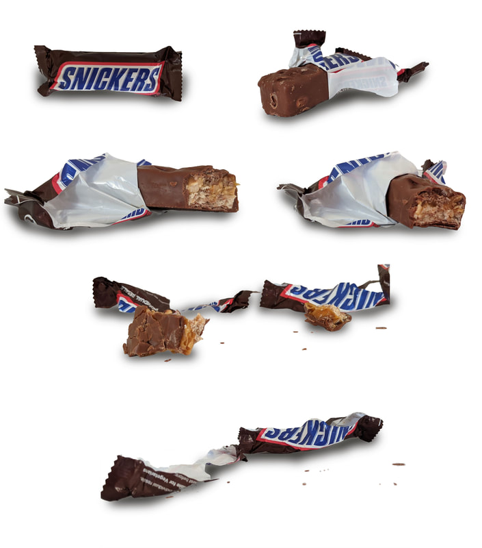

What Went Well And Even Better If?
WWW: One thing that went well was creating my composition as I would scrunch up the wrapper or break pieces from the chocolate as I neared to finish the bar.
EBI: While selecting the subject of my image some parts of the subject did not get selected
EBI: While selecting the subject of my image some parts of the subject did not get selected
Luke Stephenson - Response
In todays task we had to responded to Luke Stephenson gif by taking an image of a certain subject with multiple shapes of the object.
Set 1

Set 2

What Went Well And Even Better If?
WWW: Keeping the position of the crisps the same so they won't look they are moving while the GIF showcase's the images.
EBI: It was hard to the control the lighting and contrast of my subject as the object looks flat in the gif.
EBI: It was hard to the control the lighting and contrast of my subject as the object looks flat in the gif.
PhotoJoiners
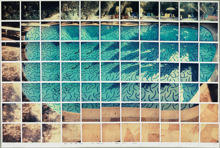
David Hockney
David Hockney is connected to the pop art movement. This movement was interested in responding to popular culture.
Hockney has also created photo joiners. Photographs are taken of the same object from different perspectives. The images are then collaged to recreate the place, person or object even though they may look distorted. This work connects with the cubism movement, one of Hockney's major aims.
Hockney has also created photo joiners. Photographs are taken of the same object from different perspectives. The images are then collaged to recreate the place, person or object even though they may look distorted. This work connects with the cubism movement, one of Hockney's major aims.
Photomontages Analysis
|
In this image, David Hockney created an example of the cubism movement. He was inspired by the pop culture of photography and the pop art movement. In this image we as the viewer can interpret the thorough detail of the texture of the swimming pool, giving this playful or 'cartoonish' affect towards his audience, showcasing the movement of pop art. Furthermore, we can see in the photo that Hockney took multiple images of different perspective of his setting, describing to his viewers on how the human vision works through photography, which is an example of the cubism movement . This use of creating multiple different perspectives of the subject, seems as if the water of the swimming pool is over flowing from the image.
In conclusion, I think David Hockney's Intention in the photograph was to show his audience on how the human eye is shown to act, perceiving the information of our own environment, and describing how our vision flickers through different subjects. |
Comparative Study - David Hockney & Pablo Picasso
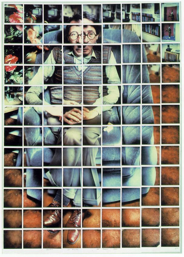
Kasmin,28th March 1982
|
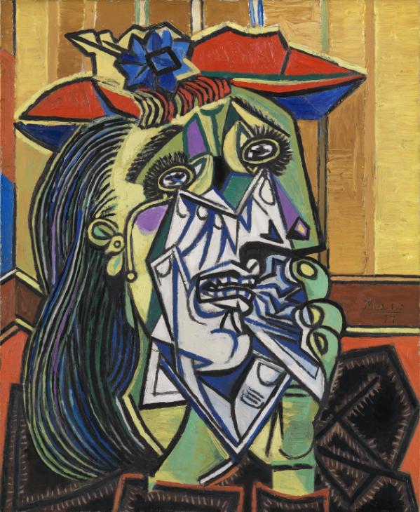
Pablo Picasso - Weeping Woman, 1937
|
In both Images we as the viewer can see that both artists created an example of the cubism movement, illustrating movement through different perspectives. The cubism movement was a revolutionary new approach to representing reality, the movement was invented around 1907 - 1908 by the artists Pablo Picasso and Georges Braque. The cubism movement brought different views of subjects together in the same image, creating photos or paintings that appear as if it's been fragmented or abstracted. The purpose of the cubism movement was an experimental pursuit of visual excitement that conveyed the original presence of the subject. The aim of the movement was to develop a new way of seeing the world around of us, and artists illustrated this by using the tool of the human vision and photos or paintings.
Firstly, in David Hockney's photo, Kasmin, his intentions were to describe on how the human eye perceives a subject, and how our vision examines the subject in front us and how every movement occurs through those seconds. David Hockney illustrates this by taking an image separately each time the object or subject moves, revealing beautiful textures and form multiple photos combined together forming one image. Though the photos don't match up each other, it reveals a story from David Hockney's vision and describing the movement of his eye in an abstract form by one photo at a time. Techniques that David Hockney used were polaroid prints and 35mm print colours, then composed the single images into a collage, creating this abstract photograph. In comparison, Pablo Picasso's image, Weeping Woman, describes the similar intentions of Hockney's image, as they both demonstrate aspects of the cubism movement. Picasso's wanted to emphasise the difference between art and reality, he did this by incorporating both his observations and memories, while creating his cubism images. He also wanted to demonstrate the theory of man being not only one but two, implying a darker meaning throughout his image. Techniques that Pablo Picasso used to create his paintings were engraving, dry pointing, etching, and aquatinting of his printmaking, resulting in these miraculous abstract images.
In conclusion, both images have similar intentions in each image, as they both cooperate the cubism movement. We as the viewer can also interpret both images describe and illustrate texture in a significant way, for example, in 'Kasmin', the image illustrates the detailed wrinkles of the sofa, giving this momenta feeling throughout the photo. In 'Weeping woman', texture is shown throughout the subject, outlining the patterns of the face and hair. Along similar lines, both images express how the vision or mind perceives a subject. For example, Hockney describes the movement of the eye evaluating the subject, expressing this movement of the eye through the photo 'Kasmin'. Likewise, Pablo Picasso describes his view of a subject and expresses his view on society, as the image shows the part of the face having a different pattern and colour, claiming that society has two sides amongst it. On the other hand, 'Kasmin' demonstrates depth and form by shadows through his multiple pictures, giving contrast and highlight to the subject, whereas, there is little form and depth in the image 'Weeping woman'. Finally, 'Weeping woman' showcases the use of bright colour, demonstrating an abstract motive to the image and a movement of pop art.
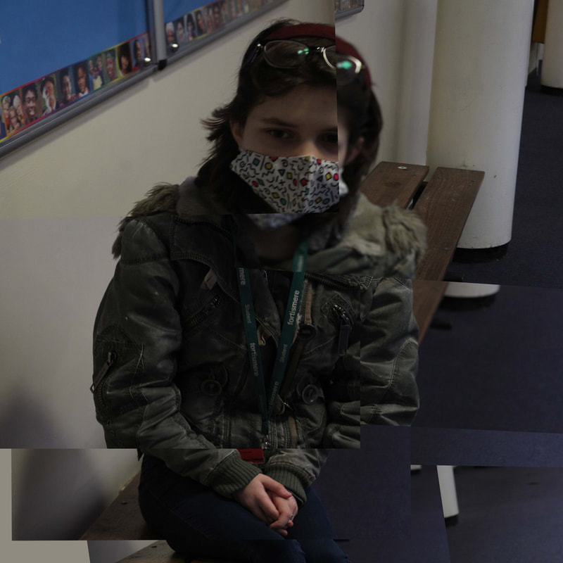
Practical Task - Photo joiners
Task 1 - Object
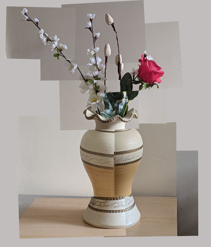
What Went Well And Even Better If?
WWW: The collage of the images were placed exactly together making the image look like a single object.
EBI: The background was the same for each image.
EBI: The background was the same for each image.
Task 2 - Setting/Room
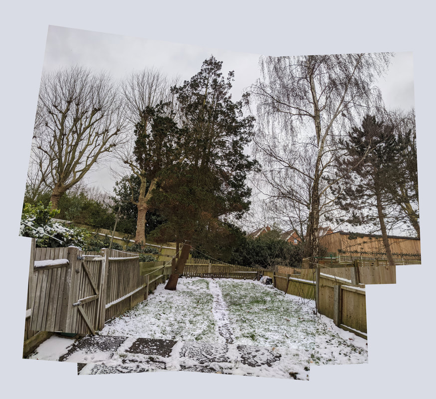
What Went Well And Even Better If?
WWW: The composition had complexity which makes it more appealing towards the viewer.
EBI: The pictures did not overlap with each other.
EBI: The pictures did not overlap with each other.
Set 2
Set 3
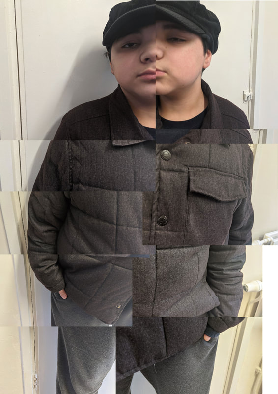
What Went Well And Even Better If? - Set 1 + Set 2
WWW: Editing parts of the image and placing them in there designated area to seem as if the picture has been ripped apart and creating an example of the cubism movement.
EBI: Many of the pictures overlapped with each other which meant I had to cut a few images out of the collage and the face did not piece togthere.
EBI: Many of the pictures overlapped with each other which meant I had to cut a few images out of the collage and the face did not piece togthere.
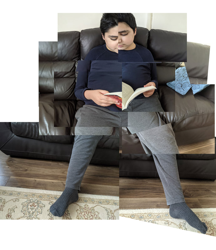
What Went Well And Even Better if? - Set 3
WWW: I managed to balance my ISO as the location and time I took the image was very dark. My ISO was at 400.
EBI: While taking the images of my subject many of the images were in not in the right area for my subject as I moved around while taking my images. I should improve by staying in the same position throughout the shoot.
EBI: While taking the images of my subject many of the images were in not in the right area for my subject as I moved around while taking my images. I should improve by staying in the same position throughout the shoot.
What's Next
Next time, I will manage to stay in the same position while taking the subject of the image, as it would improve the positions of the layer while editing them into a photo-merge.
Light And Focus
Uta Barth

|

|
What Are Uta Barth's Intention's?
Uta Barth creates contemporary images, and addresses themes such as perception, optical illusion, and non-place. She does this by creating lines of lights which her camera captures in the series of photographs and inverting her own body parts into the photographic frame. She wants us to consider the viewers own judgment of the photograph as she wants the audience to walk out the gallery and perceive the world differently when they entered to the gallery and left.
What Wider Issue Is The Photographer addressing?
Barth is considering of making the viewer aware of their own thoughts and processes while they look at her image in the gallery. This is shown by the light passing through the cloth giving this momenta or fragile feeling towards the audience, and expressing this by the movement of minimalism and space movement. She was interested in this issue because she is trying to make her viewers aware of their own thoughts and processes while they look at the photo. She wants her audience to see a different perception of the photograph on the gallery wall.
How Do The Materials And Techniques Used To Support The Photographer's Intentions?
Barth has used multiple exposures in creating this work. This creates a blurred effect as Uta Barth deliberately puts her camera out of focus of the faint view of the highway. She creates a blurred effect in her photo because she wants her audience to search the subject or the focus in the image. Furthermore, the muted colours of red, blue and brown creates a dramatic effect to the image as these colours captures the viewers attention, as they stand out the most in the image. This helps supports Barth's point about her audience being aware of their own thoughts and processes while they look at the photo as the image illustrates the idea for finding the focus the viewfinder is looking towards at.
My Response - Uta Barth
In this task I was required to responded to Uta Barth, by using an object or creating interesting shape that forms an unexpected shadow. The criteria was to create light and shadow, and contrast. This response links to the theme of minimalism, light, and the contemporary movement.
Best Edits


Set 2
Set Up Process
To capture these images I placed a pot a flowers on a desk near the wall, and placed a flash light on it to create these interesting shadows. I had to 'play' around with the position of my flashlight to angle the flowers shadows in different directions to take the best image which fit the theme of Uta Barth. The images differed to natural light as some of shadows were less contrasted, compared to shadows in natural light.
Best Edits

|

|
Set 3
Set Up Process
To take these images I had to position the subject of the image to the side of my composition and place my camera away from the subject of the image and take the whole composition. After this, I edited my images by creating an 'out of focus' or blurred image by using gaussian blurred.
Best Edits


What Went Well And Even Better If? - Set 1
WWW: The subject I chose to photograph which suite the theme as it, the natural light created interesting shadows throughout the subject.
EBI: The background of the composition did not create shadows behind the subject as it distracts the attention of the main object.
EBI: The background of the composition did not create shadows behind the subject as it distracts the attention of the main object.
What Went Well And Even Better If? - Set 2
WWW: My images expressed my intentions to create interesting shapes (shadows) by an object.
EBI: The time of day was not appropriate to take the images as there was no natural light to create the shadows by the object, which meant that I hade to use a flash light to the create the interesting shapes of the shadow.
EBI: The time of day was not appropriate to take the images as there was no natural light to create the shadows by the object, which meant that I hade to use a flash light to the create the interesting shapes of the shadow.
What Went Well And Even Better If? - Set 3
WWW: My images express my intentions which were making the subject out of focus from the composition
EBI: My images are too blurred, making it hard to tell what the subject is of the photo.
EBI: My images are too blurred, making it hard to tell what the subject is of the photo.
What's Next?
Next time I will look at more examples of Uta Barth's work to inspire a more deception of what I want to achieve, for example, shadow, use of natural light, and out of focus perception of a subject
Ordinary to Extraordinary
In this task today I was required to respond to Edward Weston by using different techniques of light, such as, artificial light and natural light.
Edward Weston
|
The camera that Edward Weston used to take his images was a Graflex camera. The Graflex camera benefited Weston to see his subject matter in the right format before taking the photograph. This camera was also portable.
Westons philosophy about photography was that he developed his own photographic language. The image had to be pleasing towards him and his composition had to be in precise framing of his camera. Edward Weston was known as the master of composition. This was an example of the f64 movement in photography. The issues that Weston encountered when photographing the pepper was his camera lacked depth of field on f64. To resolve this issue he create his own aperture (f240-pinhole). Furthermore, to get his subject matter all in focus he had to use a long exposure for the pepper photos, which he left his exposure for 4 - 6 hours. The image was also incorporated with natural light which created a movement of light over the course of the long exposure, which gave the pepper a luminous quality. |

|
My Response: Natural Light
In this task I had to respond to Edward Weston by using natural, creating light and shadow on my images.
Best Edits


What Went Well And Even Better If?
WWW: One thing that went well was the use of strong contrast in my images.
EBI: The composition was tightly cropped.
EBI: The composition was tightly cropped.
My Response: Artificial Light
In this task I had to respond to Edward Weston by using artificial light, creating strong light on my images.
Best Edits


What Went Well And Even Better If?
WWW: Depth of field to highlight the main subject of my image.
EBI: to improve the focus of my images and to not to crop my images to close and tightly.
EBI: to improve the focus of my images and to not to crop my images to close and tightly.
What Did I learn From The First Set That Helped With The Artificial Light Set?
One thing I learnt from the first set that helped me produced the images of artificial light was that to create appealing images I had to place the light towards the objects that I want to stand out. I also had learnt that my depth of field was very important so the main subjects can be highlighted in the image.
Independent Development
Enrico Becker - GMF Series
Enrico Becker is a German multidisciplinary designer who was raised in Leipzig and is currently working and living in Sydney. Enrico's work is based on his desire to combine his German heritage and the Sydney lifestyle throughout his photograph's. His intentions in his images is to explore the issues of genetically modified food. The series of Enrico's still-life photographs, illustrates a play full look at how GMOs could look 'beautiful'. Becker is apart of a generation of young photographers who are revitalising the still life movement as a form of creative expressions.
Photographer Link
Outline Of My Idea
My idea of responding to Enrico Becker is by placing a group of fruits and fully saturating the colours or adding different colours to create the colourful images by applying hue saturation to one area of the subject by using the masque tool and applying the colour I want on that area of my subject. Furthermore, I would be also adding a less saturated background to the subject as it would distract the audience from the main subject of the image.
My Response
Best Edits


What Went Well And Even Better If?
WWW: The subject I chose to photograph suited the theme as it was very colourful, which represented the theme of a still-life series of GMF.
EBI: The subjects shadow wasn't perfectly displayed in the image.
EBI: The subjects shadow wasn't perfectly displayed in the image.
What's Next?
To improve my images I will experiment further with composition.
Ana Straze - Forbidden Fruits
Ana Straze is an Slovenia-based photographer which manipulates food and positions of the small pins or pearls in multiple patterns as an attempt to alter the meaning of everyday objects.She presents her images in a series of 'Forbidden Fruits'. Straze cuts up or peel off fruits and vegetables, and place small pins of pearls to create these contemporary still lives of common foods. The use of the pearls is to evaluate the structure of the objects and complement the foods by adding a new perspective towards the viewer to alliterate the meaning of everyday objects by discovering the limits of aesthetics and given space.
Photographer Link
Outline Of My Idea
Idea 1 = To create these images I would be cutting up some foods and place paper clips to create a series of colourful images. I would also be painting my objects to add to my series of compositions to apply the same techniques and ideas of Enrico Beckers images of his GMF series, combining both the techniques of Ana Straze and Enrico Becker to present a series of Images of 'Forbidden Fruits'.
Idea 2 = Another way I would create these images is by moulding up pearls (using clay) and placing them on cocktail sticks or paper clips to create a similar image to Ana Straze. Furthermore, I would also digitally saturate the fruits to incorporate ideas of Enrico Becker to improve my composition.
Idea 2 = Another way I would create these images is by moulding up pearls (using clay) and placing them on cocktail sticks or paper clips to create a similar image to Ana Straze. Furthermore, I would also digitally saturate the fruits to incorporate ideas of Enrico Becker to improve my composition.
My Response
Best Edits


What Went Well And Even Better If?
WWW: The subject I chose to photograph suited the theme as Ana Straze presented images in a series of 'Forbidden Fruits'.
EBI: I experimented further with my composition.
EBI: I experimented further with my composition.
What's Next?
Next time I will look at the work of Ana Straze to inspire a more accurate depiction of what I want to achieve.
